Category: Illustration (Page 6 of 10)

Bremain: Creative posters for the pro-EU campaign

Stay-Remain-positive-john_bond_via setaprint-blog

John Bond

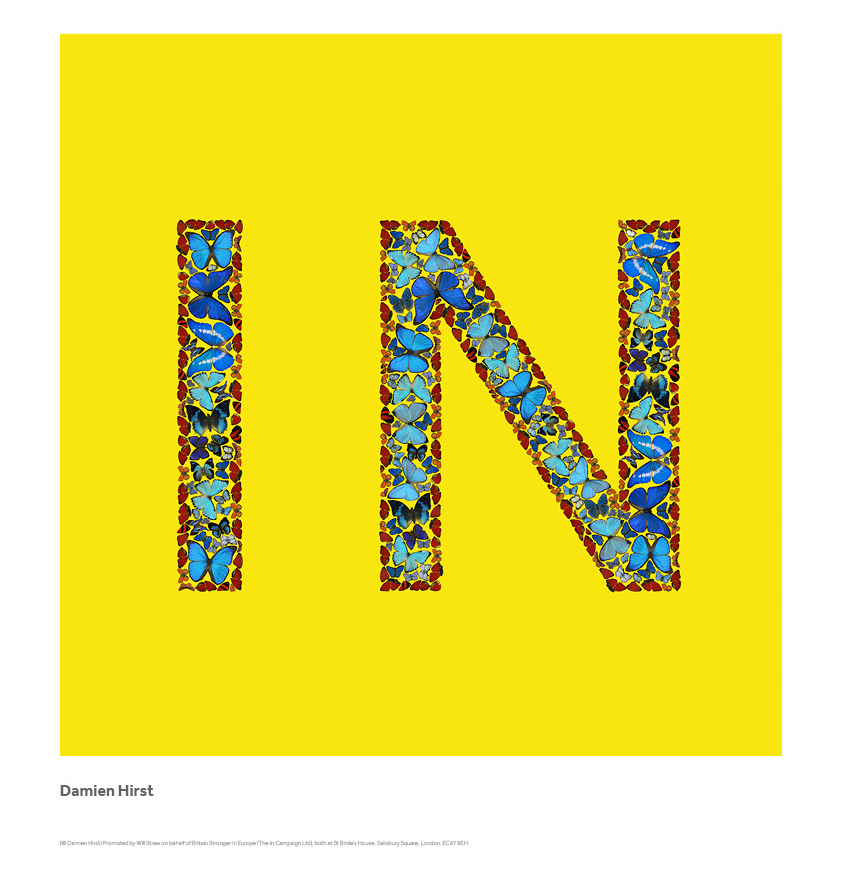
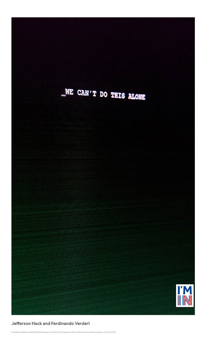
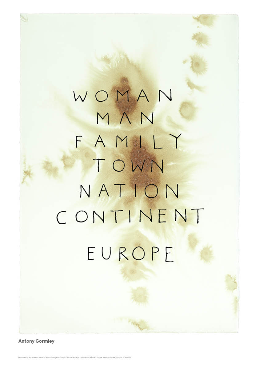
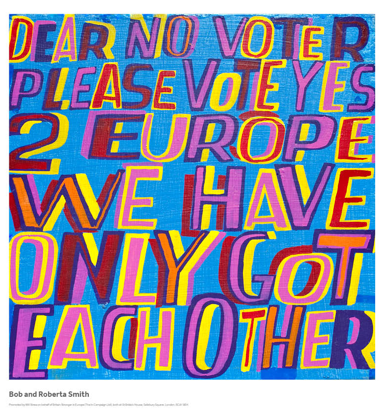
Today is Britain’s EU membership referendum. Focusing on the creative side of the campaigns, I have selected my favorites, from the many, pro-EU posters created by British artists all over the world.

BSIE_(DAMIEN_HIRST)-via setaprint-blog

BSIE_(Jefferson_Hack_and_Ferdinando_Verderi)-via setaprint-blog

BSIE (ANTHONY_GORMLEY

BSIE (BOB___ROBERTA_SMITH

BSIE ANISH KAPOOR BSIE (AXEL SCHEFFLER)

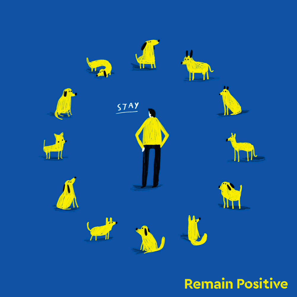
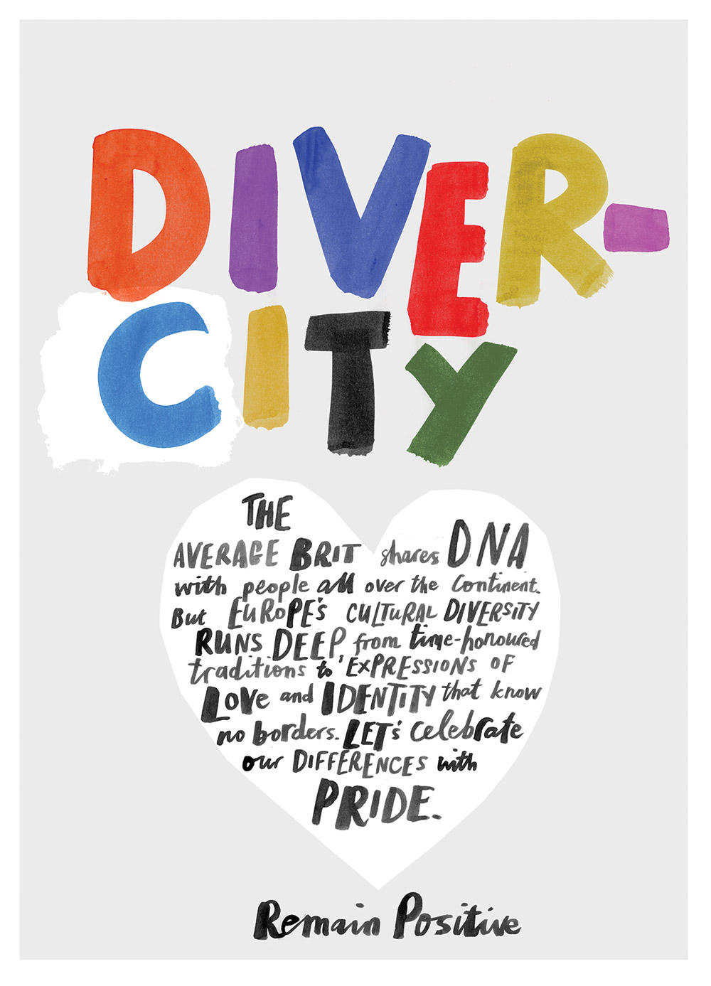
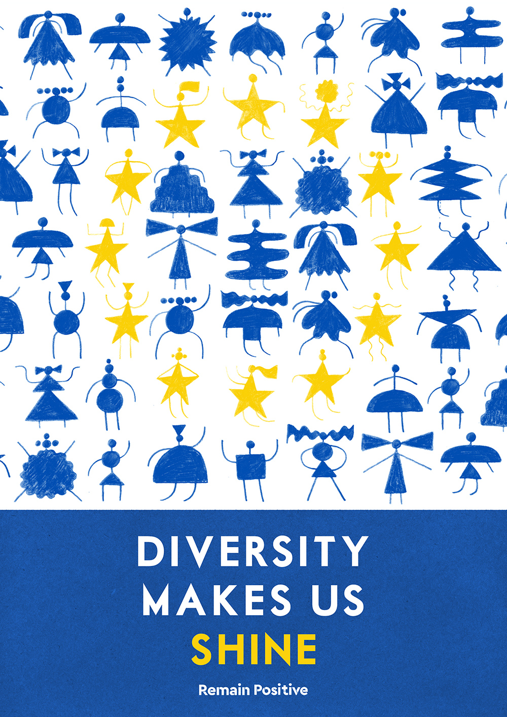
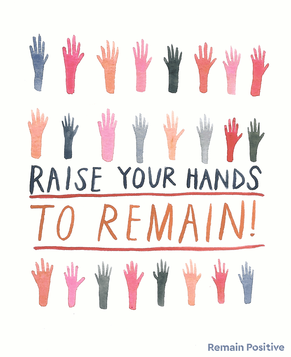
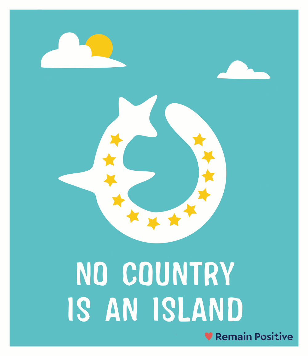
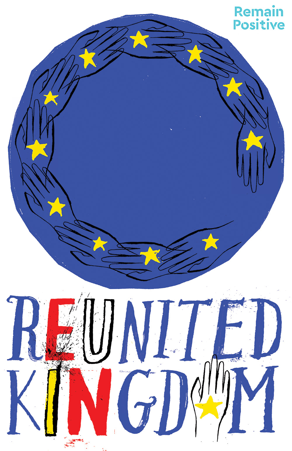
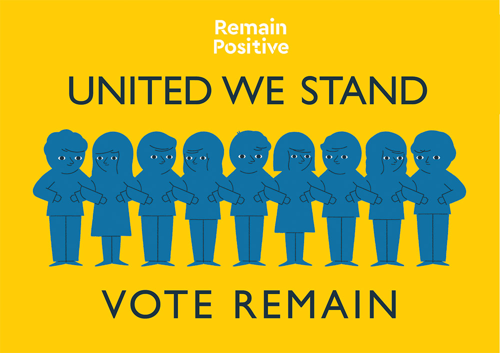
The British referendum reminds me a lot of  our own Greek referendum almost one year ago and I can say that the worst thing from that experience was the extreme polarization (almost hostility) of the opposite sides. So I totally agree with the Remain Positive campaign that urges pro-remain artists to design and contribute an image with a thoughtful and positive message for the pro-EU cause. The team behind Remain Positive says: “We are truly saddened to see the debate conducted as fear vs fear. We feel something terribly important has got lost amid the shouting. So for these last few days, these days in which the undecided will choose the future for all of us, we want to flood to the Internet with these positive arguments.” 
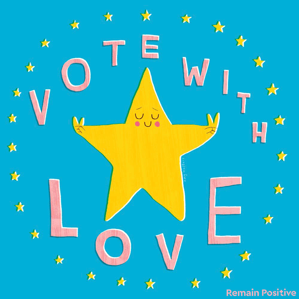
Remain-positive-sungif_via setaprint-blog

amy_walters-Remain-positive-via setaprint-blog

Amy Walters


jonny_glover-Remain-positive-via setaprint-blog

Jonny Glover

rich_dinnis-Remain-positive-via setaprint-blog

Rich Dinnis

Diversity Marion Deuchars Remain positive

Marion Deuchars

Diversity / Remain positive

kelley rich Remain positive

Kelley Rich

No country is an island Remain positive


Reunited Kingdom Remain positive

United We Stand Remain positive

Also, Wolfgang Tillmans created a series of anti-Brexit, open-source posters for Remain European Union referendum campaign.

(via)

Uppercase & Flow magazines

UPPERCASE 29 magazine cover

Flow international cover

My latest obsessions are Uppercase and Flow. In the beginning of the year I decided to make a gift to myself and finally subscribe to these two magazines.

  • Uppercase is an independent quarterly magazine from Canada, founded by publisher, editor and designer Janine Vangool. Designed with great attention to detail, it covers almost all creative fields. Every issue has a different theme on either design, crafts, illustration or printing and has very little advertising since it is supported by subscriptions around the world. So much fresh talent and creativity to discover! Check out the current issue here. You can also find real gems in the past issues.
  • Flow on the other hand, comes from a big publishing group in the Netherlands (there is an English edition too) but hasn’t lost the personal touch and has a unique independent feel. It is, as the two founders say: “A magazine of unhurried time” “… all about positive psychology, mindfulness, creativity and the beauty of imperfection.”. Flow has a special love for paper: they always have a gift made of paper, they print on different types of paper and they even have a special edition for paper lovers, which is so good I don’t let my kids go near it. All issues have beautiful illustrations and great choice of vintage photography. Check out the current issue here.

Serge Bloch’s whimsical illustrations

serge bloch oeuf

serge bloch hiboulon

serge bloch tirbuson

Don-quichotte serge bloch gif


serge bloch orange lady

serge bloch fermouar


 serge bloch bavarian rochester gif


veggie fashion serge bloch

serge bloch british coffee


serge bloch blahblah

I am sure I had seen Serge Bloch‘s whimsical illustrations around, before I knew his name and that he is French. His huge amount of work includes a lot of editorial and book illustrations, but has also done excellent work for advertising campaigns and ads. I love his sense of humor in using everyday objects in a new creative way.


The first augmented reality cover for The New Yorker

Christophe-Niemann_New-Yorker_front

Amazing! Illustrator Christoph Niemann has created the latest cover for the New Yorker but it’s the first time, augmented reality technology is used to animate its cover artwork, with the help of London studio Nexus.

Niemann’s front and back cover illustrations feature a commuter jumping through the subway doors with a tablet and coffee in hand (actually she reminds me of the Statue of Liberty!). When these are viewed through augmented reality app “Uncovr” they come to life, becoming a fully animated cityscape where the subway doors shut and the train travels through New York.

(via)

Stamp collection: Destination Greece

Destination Greece, stamp collection, greek island

Destination Greece, stamp collection, olive

Destination Greece, stamp collection, all stamps

Destination Greece, stamp collection, cycladic figure

I love this stamp collection by Athens-based graphic designer & illustrator Mike Karolos. It is called ‘Destination Greece’ and is a self-initiated project that aims to show – among the economic crisis – the beautiful side of Greece. Karolos has a very distinct graphic style in most of his work, drawing inspiration from abstract and pop-art style.

Can someone turn these into real stamps please? Thank you.

(via)

« Older posts Newer posts »

© 2025 Setaprint

Theme by Anders NorenUp ↑