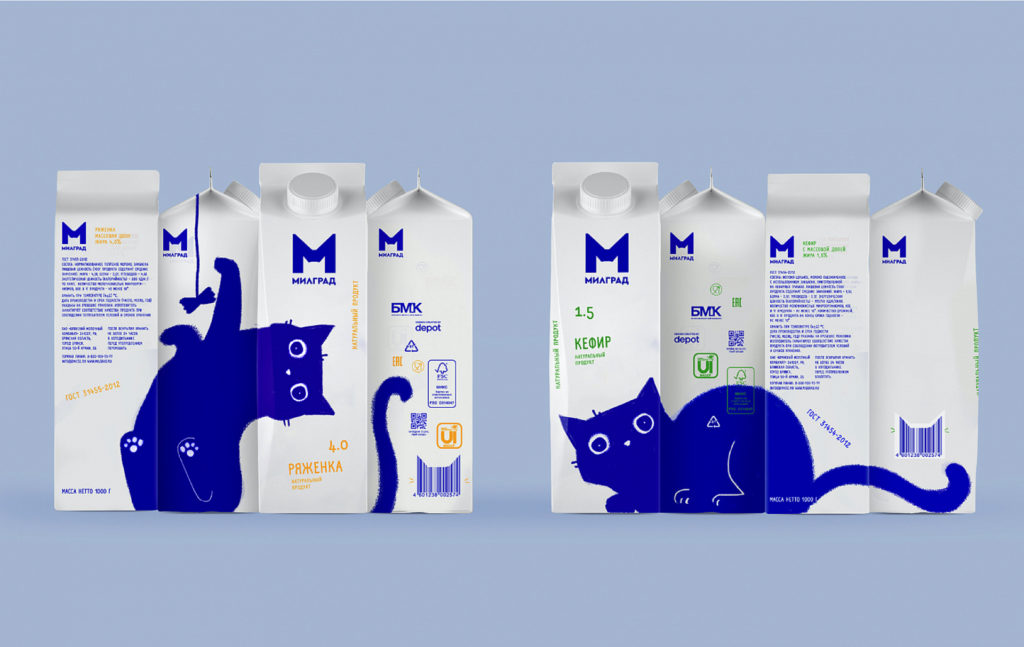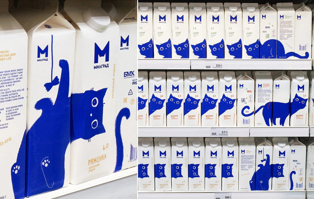

Russian Depot Branding agency has developed the new branding identity for Milgrad’s milk packaging. The agency is aiming to stand out on the dairy shelf, with the help of a playful blue cat that appears around the package creating different effects.


Russian Depot Branding agency has developed the new branding identity for Milgrad’s milk packaging. The agency is aiming to stand out on the dairy shelf, with the help of a playful blue cat that appears around the package creating different effects.
I love both the product and the packaging for these fun puzzles.
“Created and designed by Brooklyn design duo Charles&Thorn, each Four-Letter Puzzle features one word, broken into four individual gold-foiled stamped letter puzzles. Once complete, you’ll spell out a favorite four-letter word — YEAH, CRAP, LOVE, and FUCK are all up for grabs.”
Maybe not for kids though, 😜.
This gin packaging is so cool. Designed by Simone Hodgskiss (aka Pearly Yon), an Australian illustrator, designer and letterer for a micro distillery in Belgium. Hodgskiss’ illustrations are inspired by tattoo style line work, and the color selections as well as the print finish are simply amazing.
And this is the first batch of Bonnie & Clyde, where all the beautiful type has been created from scratch by Pearly Yon, finding inspiration from the 1930’s era.
This is the great result of an extensive rebranding and new packaging for “Mills of Saint George”, a traditional series of flour products. I love the concept behind the design! Mousegraphics, the awarded Greek design studio, created the new packaging. They actually baked a series of dough shapes using the flour product, with the help of sculptor Martha Foka. Then they photographed the dough-shaped images layered on different colored backgrounds.
G Design Studio designed the branding, packaging, and typography for Kourellas Dairy, a small organic dairy farm with a line of Greek yogurts and cheeses. I love the handwritten typography! They have actually used an existing hand-painted script font, that was exclusively customized for Greek characters by Backpacker.
A really exquisite label design for a series of wine called Ploes. This is the award-winning work of Beetroot design group for Amalagos Wineries in Greece. Very minimal, with stark colors… Reminds me of Hokusai’s “Great Wave“.
I could talk about the design of the packaging for these snacks, but this time I will focus more on the actual snack and not the packaging (which is not bad either)!
These are Jimini’s edible insect snacks! Insects like grasshoppers, crickets and mealworms! The above packaging is actually for grasshoppers flavored with Greek spices (a la Grecque)!!! All of Jimini’s insects are manufactured at specialised farms in the Netherlands and then flavoured in France.
Apparently there is a market for these, because they have made an effort to create an attractive packaging… There was even a Kickstarter event for Jimini’s energy bars made with cricket flour. Maybe you would like to consider them if you have kids?
I love this “Squeeze & Fresh” packaging design for juice cups by Backbone Branding from Armenia. So simple, but in the same time so clever! The concept is actually available for purchase.
Brilliant use of the clear plastic cut-out on this pasta packaging concept. Designed by Moscow-based company Nikita, hopefully it will find its way on a real pasta packaging application.
© 2025 Setaprint
Theme by Anders Noren — Up ↑