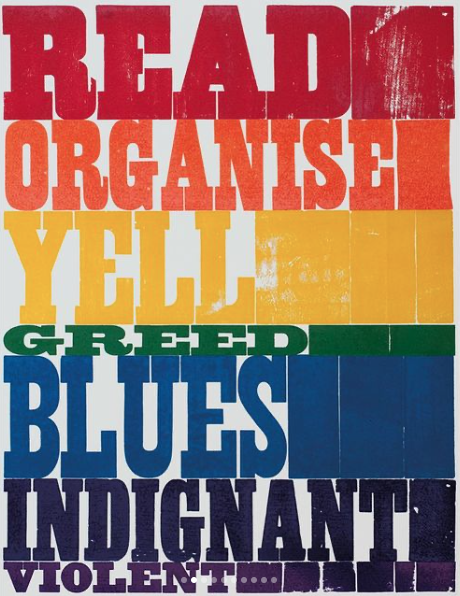
From a London exhibition of letterpress protest posters, this interesting poster is designed by Sarah Boris and printed by New North Press.

From a London exhibition of letterpress protest posters, this interesting poster is designed by Sarah Boris and printed by New North Press.
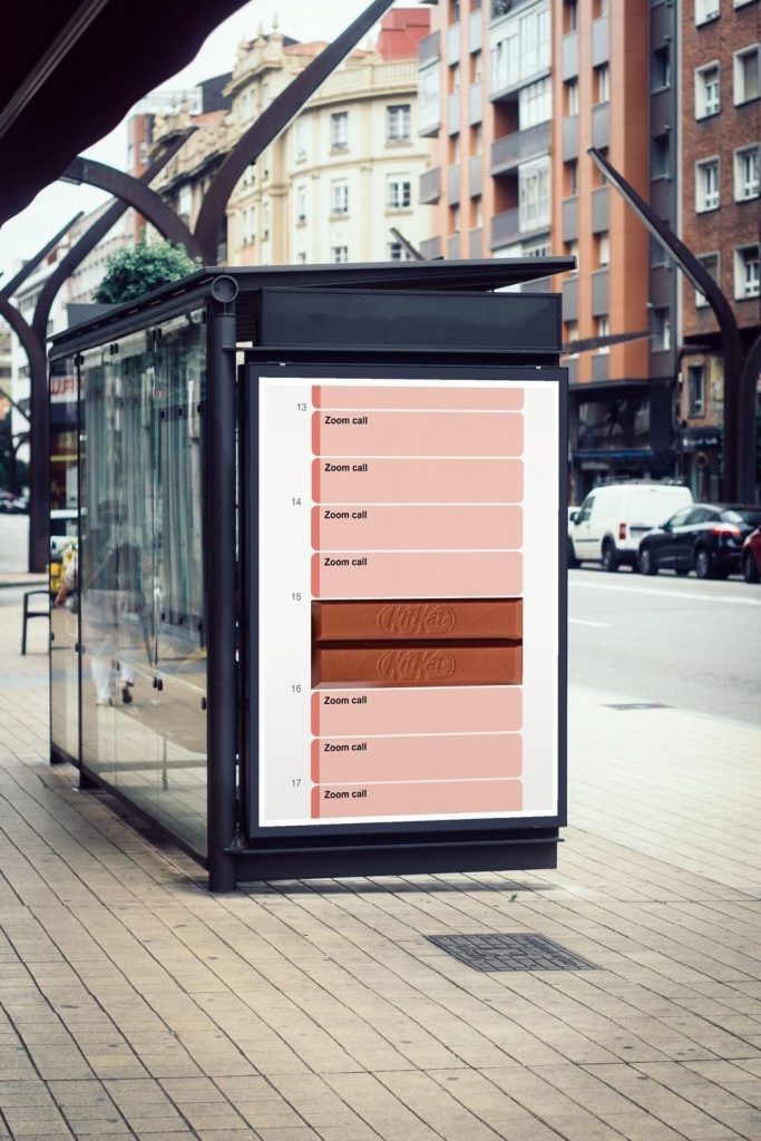
How clever is this ad by creative strategist Sam Hennig. Hennig designed this ad on spec for One Minute Briefs, a U.K. creative project.
It’s a clever play on Kit Kat’s famous slogan—”Have a break. Have a Kit Kat”—which at least in the U.K. is so renowned, the ad didn’t need to mention it. The ad has gone viral and Kit Kat even spotted the work and sought permission from Hennig to share the ad across its social channels.
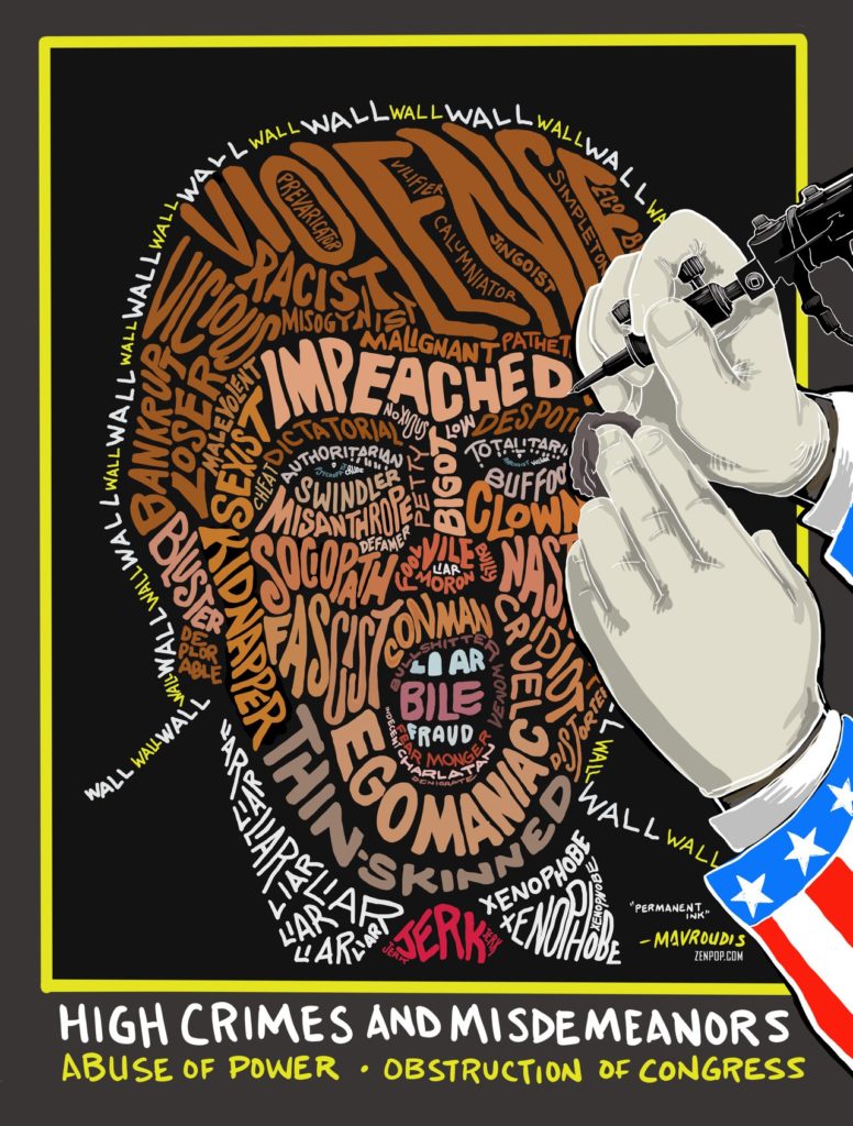
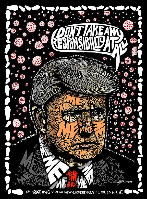
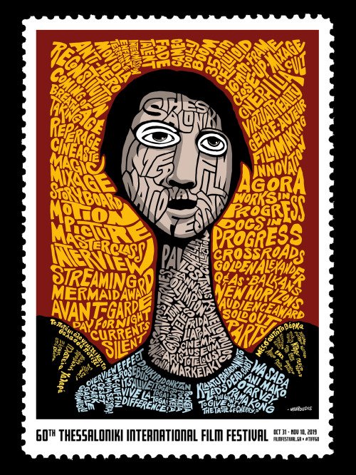
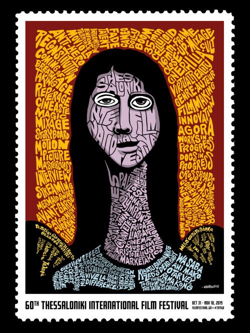
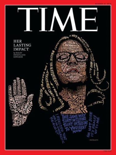
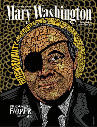
John Mavroudis is one of the most influential contemporary illustrators. He was born in California (from a Greek father and an American mother) and gained international reputation for the cover of TIME magazine, featuring Dr. Christine Blasey Ford, created by her powerful quotes. Using the same method, he previously created the portrait of US President Donald Trump for The Nation.
He is also the designer who created the posters for the 60th anniversary of the Thessaloniki International Film Festival this year.
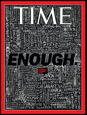
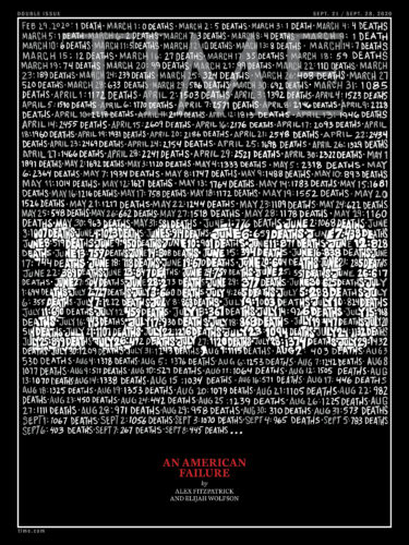
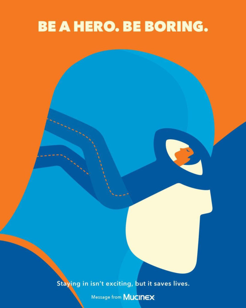
Great ad illustration for the medicine Mucinex by McCann Health, New York City
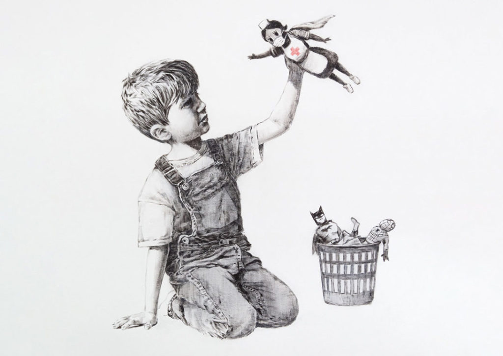
A new Banksy artwork appeared at Southampton General Hospital, playing superhero tribute to Britain’s health workers.
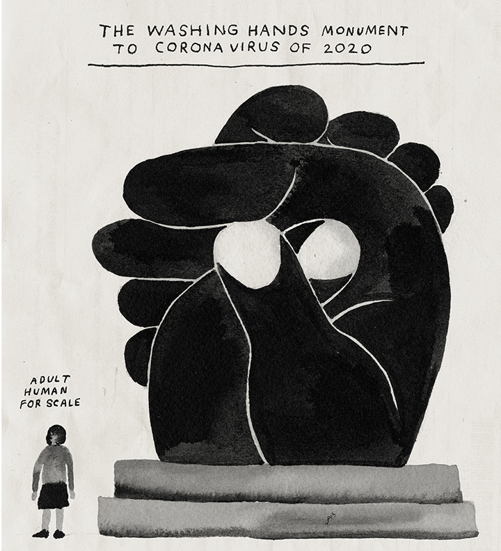
From the Art in Isolation series of the New York Times, this is “The Washing Hands Monument to Coronavirus of 2020” illustrated by Nathaniel Russell
I love this. It is one of the posters from DDB New York’s campaign for ADC’s Annual Awards “Call for Entries” from 2011. The tagline says: “Keep fighting the good fight”. I think all designers can relate to that!
This is the official poster for Yiorgos Lanthimos‘ new film: “The Killing of a Sacred Dear” designed by Vasilis Marmatakis. Once again, Marmatakis has created a strange, but also very memorable film poster, that is also special in its own way.
A beautiful screen-printed poster designed by Kostantia Manthou for Syros International Film Festival 2016, printed with love by Tind.
As commented by Bryony Gomez-Palacio, the editor of For Print Only: “Crumpled paper recreated on paper never looked as good as it does in this halftone, split fountain achievement.”
Ha! A poster with pencil shavings! Put together by CW Pencil Enterprise, all carefully arranged and labelled.
A good thing to be reminded! This is a witty poster from Hamburg-based designer Donnie O’Sullivan.
(via)
© 2025 Setaprint
Theme by Anders Noren — Up ↑